library(dplyr)
library(DESeq2)
library(edgeR)
library(ggplot2)
library(vsn)
library(NMF)
library(org.Hs.eg.db)
library(grDevices)
Exercise Introduction
The goal of this exercise is to introduce you to Bioconductor and some basic analyses on raw read counts including normalization, transformation, visualization and differential expression. You will also examine the variance and the dispersion in RNA-seq data - two concepts that are needed to understand how DESeq2 and edgeR analyse differential expression.
R Markdown
This is an R Markdown document. Markdown is a simple formatting syntax for authoring HTML, PDF, and MS Word documents. For more details on using R Markdown see http://rmarkdown.rstudio.com. When you click the Knit button in Rstudio a document will be generated that includes both content as well as the output of any embedded R code chunks within the document.
Data
The exercise is based on the following two sources:
- https://davetang.org/muse/2012/04/14/variance-in-rna-seq-data/
- https://chagall.med.cornell.edu/RNASEQcourse/Intro2RNAseq.pdf
Read counts come from a study about the profiling of poly(A)-selected RNA in LNCaP cells before and after androgen stimulation. Briefly, the study used LNCaP cells, which are androgen-sensitive human prostate adenocarcinoma cells, and treated the cells with DHT (endogenous androgen sex steroid and hormone) and with a mock treatment as the control. The poly-A RNAs were captured and sequenced on 7 lanes.
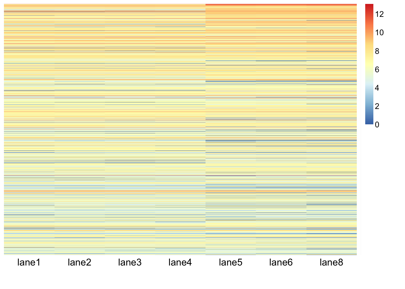
Read count table
file_url <- 'http://davetang.org/eg/pnas_expression.txt'
data <- read.table(file_url, header=T, sep="\t", stringsAsFactors=F, row.names=1)
data_subset <- data[rowSums(data[,-8])>0,]- How many genes have more than zero expression?
Counts per million (CPM) normalization
data_subset_cpm <- data_subset[,-8]
colSums(data_subset_cpm)
## lane1 lane2 lane3 lane4 lane5 lane6 lane8
## 978576 1156844 1442169 1485604 1823460 1834335 681743norm_cpm <- function(x){
x * 1000000 / sum(x)
}
data_subset_cpm <- apply(data_subset_cpm, 2, norm_cpm)
colSums(data_subset_cpm)## lane1 lane2 lane3 lane4 lane5 lane6 lane8
## 1e+06 1e+06 1e+06 1e+06 1e+06 1e+06 1e+06Mean and variance of CPM normalized read counts
mock_var <- apply(data_subset_cpm[,1:4], 1, var)
mock_mean <- apply(data_subset_cpm[,1:4], 1, mean)
dht_var <- apply(data_subset_cpm[,5:7], 1, var)
dht_mean <- apply(data_subset_cpm[,5:7], 1, mean)
cor(mock_mean, mock_var, method="spearman")
## [1] 0.9353861cor(dht_mean, dht_var, method="spearman")## [1] 0.9139193mock <- as.data.frame(cbind(mock_mean, mock_var))
ggplot(mock, aes(mock_mean, mock_var)) + geom_point() + geom_smooth() + theme_bw(base_size = 18)## `geom_smooth()` using method = 'gam' and formula 'y ~ s(x, bs = "cs")'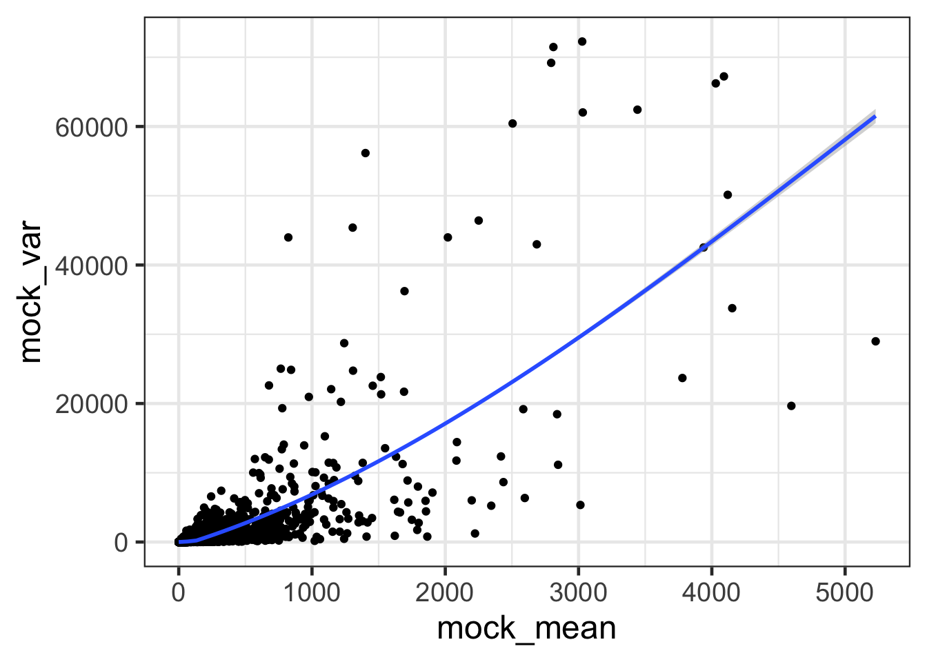
ggplot(mock, aes(mock_mean, mock_var)) + geom_point() + geom_smooth() + scale_x_continuous(trans='log2') + scale_y_continuous(trans='log2') + labs(x = 'logs(mock_mean)', y = 'log2(mock_var)') + theme_bw(base_size = 18)## `geom_smooth()` using method = 'gam' and formula 'y ~ s(x, bs = "cs")'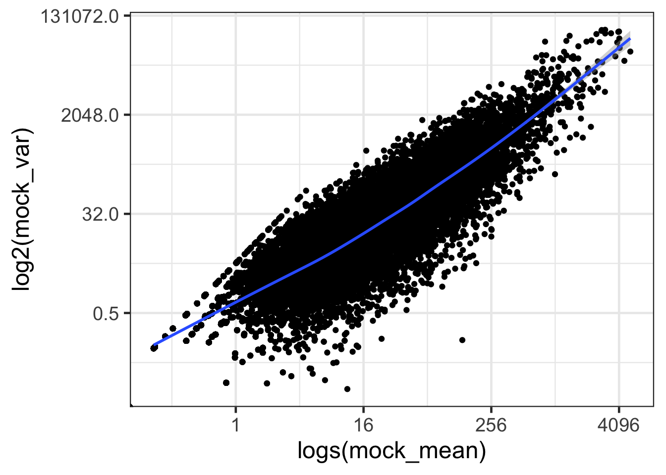
dht <- as.data.frame(cbind(dht_mean, dht_var))
ggplot(dht, aes(dht_mean, dht_var)) + geom_point() + geom_smooth() + theme_bw(base_size = 18)
## `geom_smooth()` using method = 'gam' and formula 'y ~ s(x, bs = "cs")'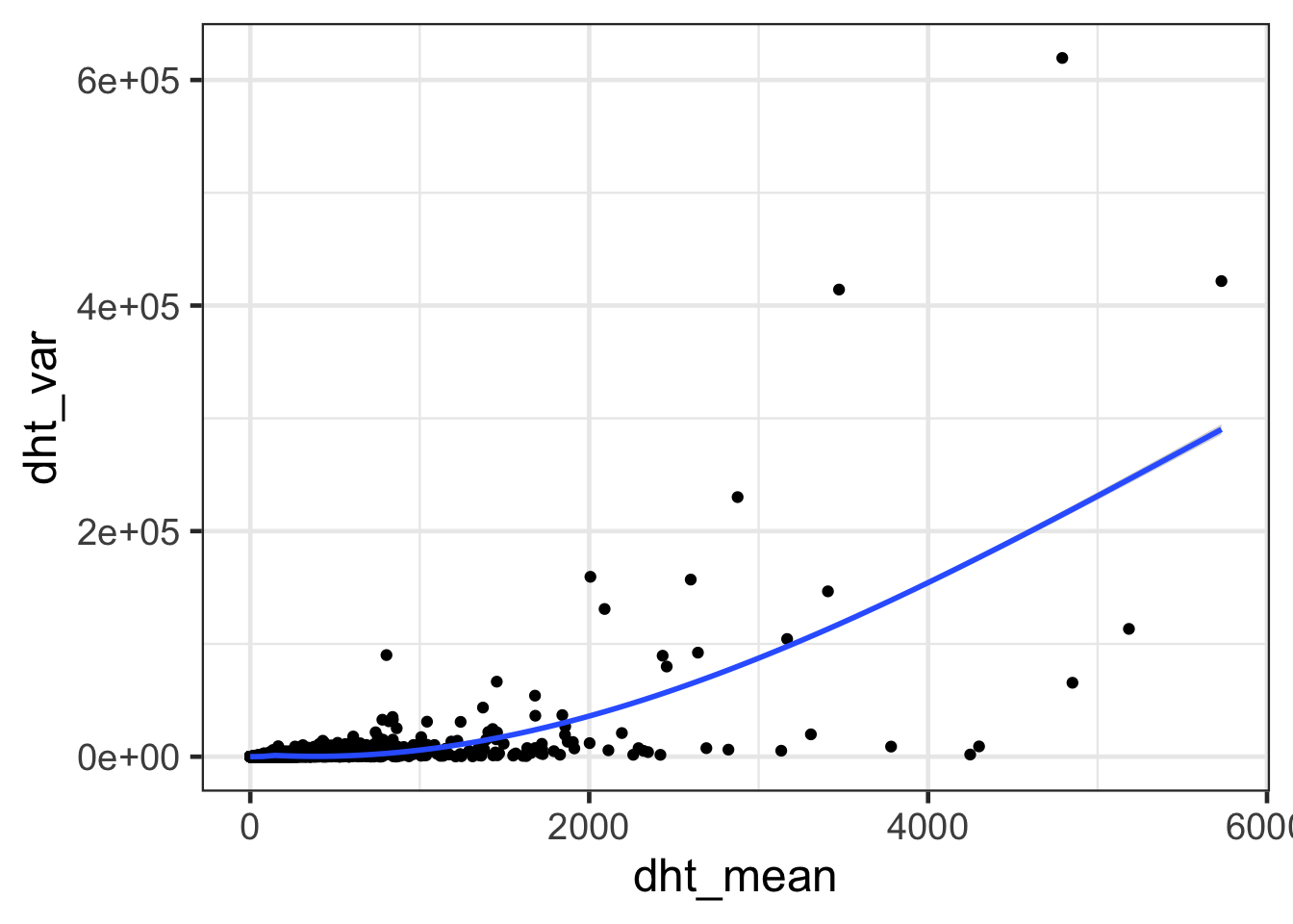
ggplot(dht, aes(dht_mean, dht_var)) + geom_point() + geom_smooth() + scale_x_continuous(trans='log2') + scale_y_continuous(trans='log2') + labs(x = 'logs(dht_mean)', y = 'log2(dht_var)') + theme_bw(base_size = 18)## `geom_smooth()` using method = 'gam' and formula 'y ~ s(x, bs = "cs")'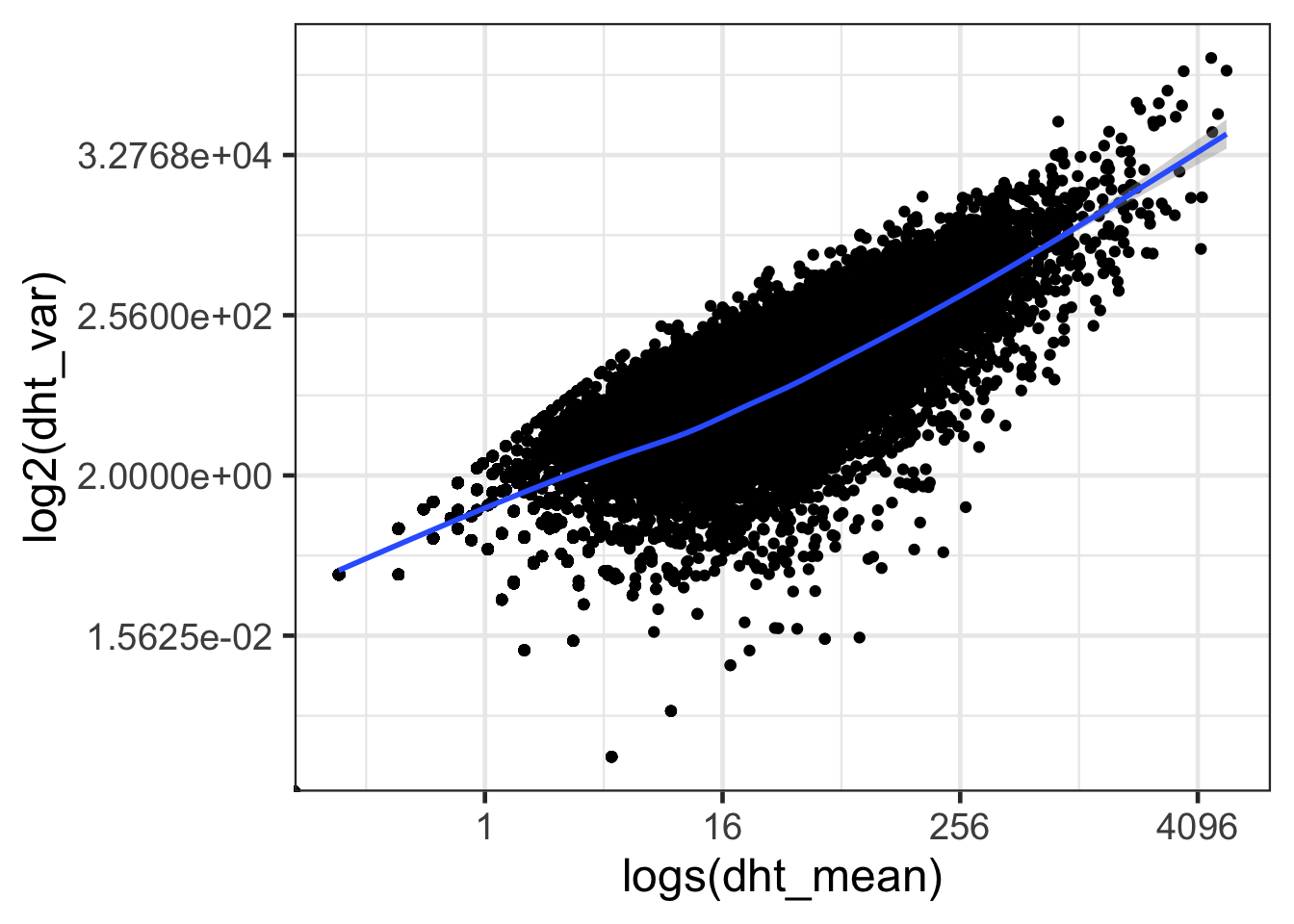
- How are mean and variance correlated?
- Differ mean and variance between Control and DHT treatment samples?
Gene dispersion in EdgeR
d <- data[rowSums(data[,-8])>0,-8]
d <- d[,1:4]
group <- c(rep("mock",4))
d.e <- DGEList(counts = d, group=group)

#calculate edgeR’s average log2 cpm
d.e <- calcNormFactors(d.e)
d.e <- estimateCommonDisp(d.e, verbose=T)
## Disp = 0.01932 , BCV = 0.139d.e <- estimateTagwiseDisp(d.e)
summary(d.e$tagwise.dispersion)## Min. 1st Qu. Median Mean 3rd Qu. Max.
## 0.0003019 0.0209960 0.0536757 0.1563791 0.1994373 1.2338966#sanity check between edgeR’s average log2 cpm calculations versus our own
cor(d.e$AveLogCPM, log2(mock_mean), method="spearman")## [1] 0.9999541plot(d.e$AveLogCPM, log2(mock_mean), pch='.')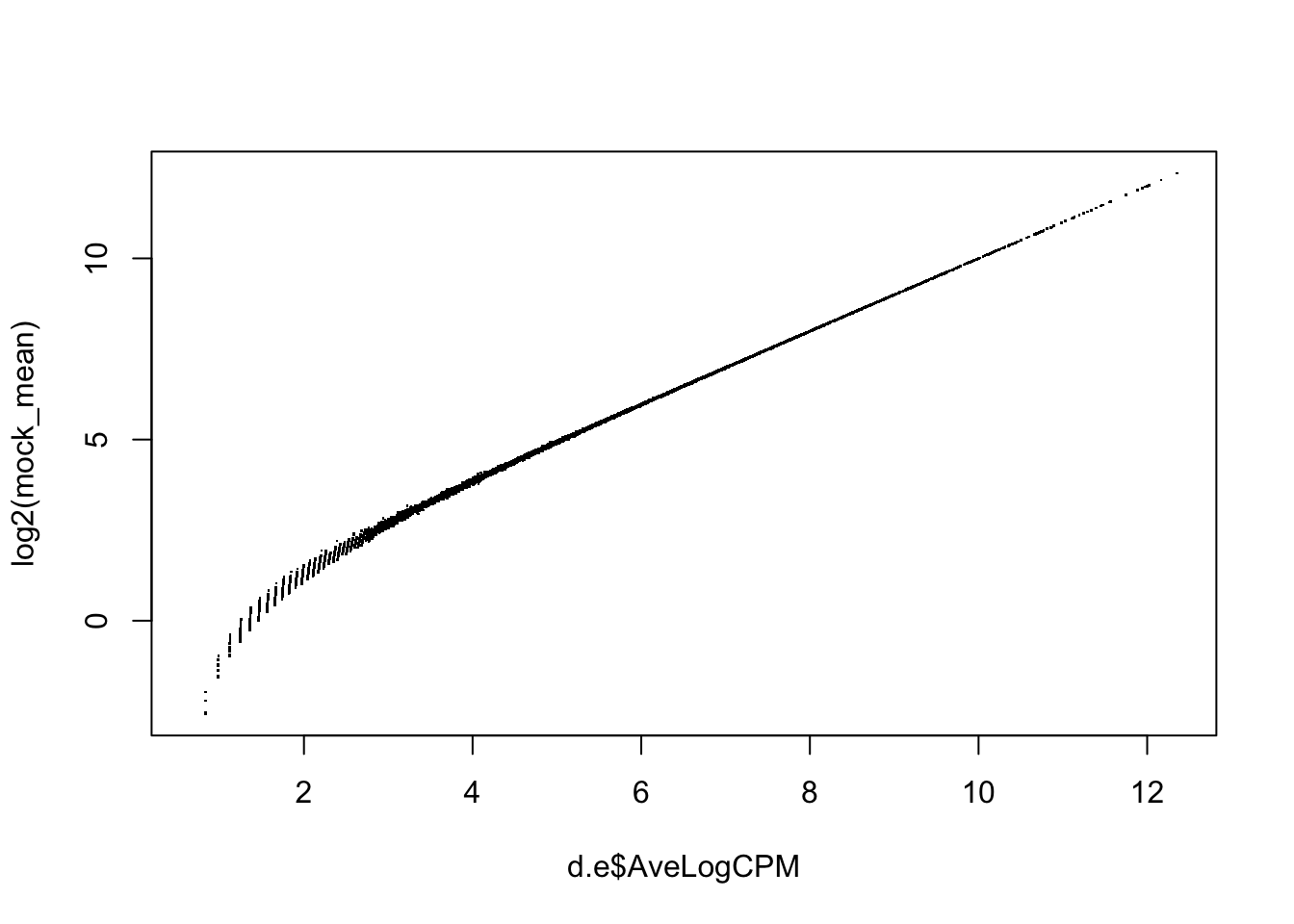
#plot the tagwise (gene-wise) dispersion against the average log2 CPM
d.df <- as.data.frame(cbind(d.e$AveLogCPM, d.e$tagwise.dispersion)); colnames(d.df) <- c("AveLogCPM", "Dispersion")
ggplot(d.df, aes(AveLogCPM, Dispersion)) + geom_point() + geom_smooth()
## `geom_smooth()` using method = 'gam' and formula 'y ~ s(x, bs = "cs")'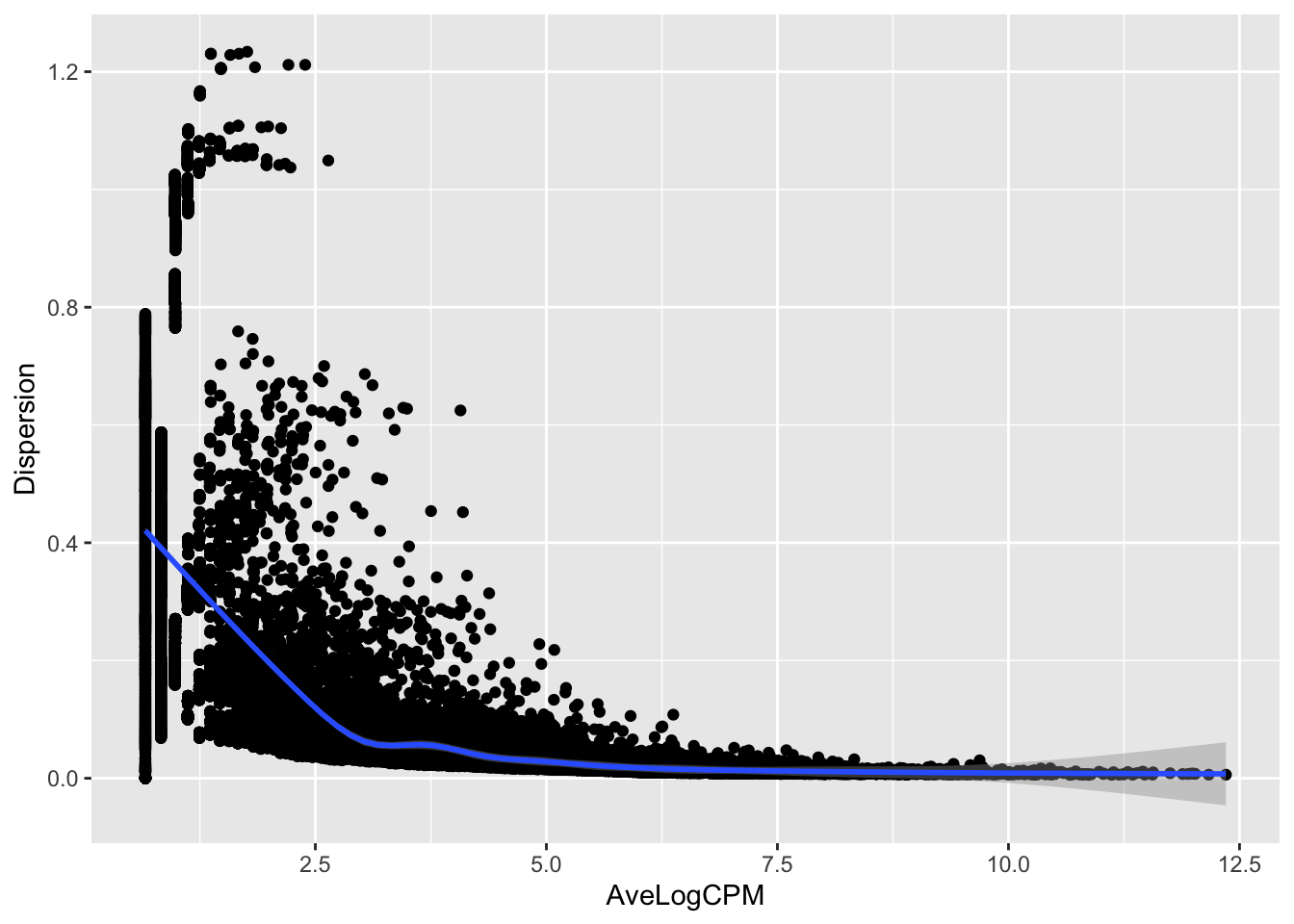
- The square root of the negative binomial dispersion is the biological coefficient of variation (BCV) across the replicate samples. So how large is the variability of the normalized read counts in the (1) mock samples and (2) DHT treatment samples?
- Are edgeR’s average log2 CPM calculation and our own log2 CPM the same?
- How are tagwise (gene-wise) dispersion and the average log2 CPM (expression level) correlated?
Gene dispersion in DESeq2
d <- data[rowSums(data[,-8])>0,-8]
sample_info <- data.frame(condition = c(rep("mock",4),rep("dht",3)), row.names = colnames(d))
sample_info
## condition
## lane1 mock
## lane2 mock
## lane3 mock
## lane4 mock
## lane5 dht
## lane6 dht
## lane8 dht#create DE dataset in DESeq2
DESeq.ds <- DESeqDataSetFromMatrix(countData = d, colData = sample_info, design = ~ condition)
DESeq.ds <- DESeq.ds[rowSums(counts(DESeq.ds)) > 0 , ]
#calculate and normalize with DESeq's size factor
colSums(counts(DESeq.ds))## lane1 lane2 lane3 lane4 lane5 lane6 lane8
## 978576 1156844 1442169 1485604 1823460 1834335 681743DESeq.ds <- estimateSizeFactors(DESeq.ds)
sizeFactors(DESeq.ds)## lane1 lane2 lane3 lane4 lane5 lane6 lane8
## 0.7912131 0.9433354 1.1884939 1.2307145 1.4099376 1.4224762 0.5141056colData(DESeq.ds)## DataFrame with 7 rows and 2 columns
## condition sizeFactor
## <factor> <numeric>
## lane1 mock 0.791213
## lane2 mock 0.943335
## lane3 mock 1.188494
## lane4 mock 1.230714
## lane5 dht 1.409938
## lane6 dht 1.422476
## lane8 dht 0.514106counts.sf_normalized <- counts(DESeq.ds, normalized = TRUE)
par(mfrow=c(1, 2))
#plot DESeq's library size normalized counts
boxplot(counts.sf_normalized, notch = TRUE, main = "untransformed read counts", ylab = "read counts")
#plot log2 transformed DESeq's normalized counts
log.norm.counts <- log2(counts.sf_normalized +1)
boxplot(log.norm.counts, notch = TRUE, main = "log2 - transformed read counts", ylab = "log2(read counts)")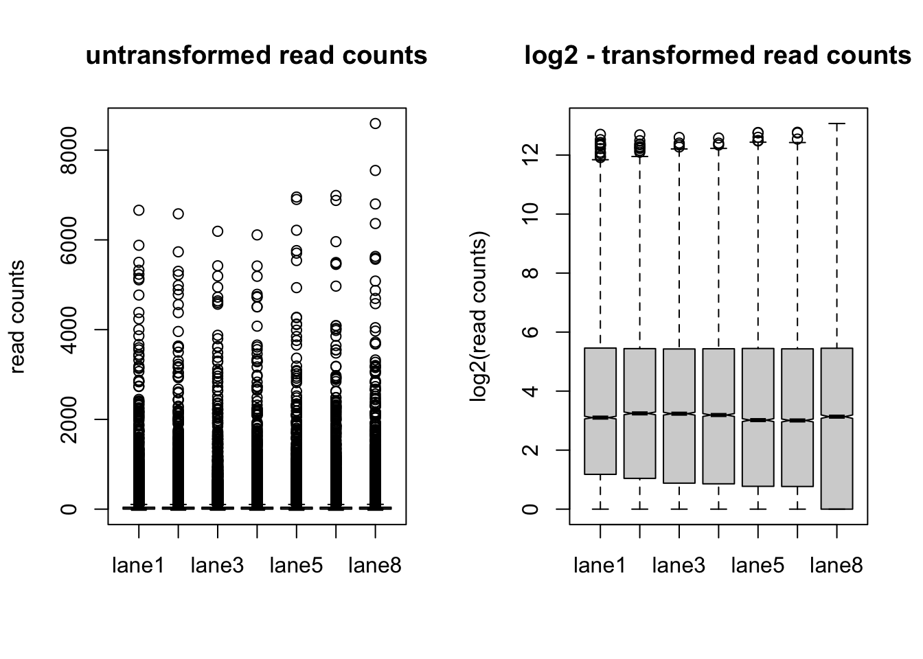
#Transformation of read counts including variance shrinkage
#DESeq2’s rlog() function returns values that are both normalized for sequencing depth and transformed to the log 2 scale where the values are adjusted to fit the experiment-wide trend of the variance-mean relationship
DESeq.rlog <- rlog(DESeq.ds, blind = TRUE )
rlog.norm.counts <- assay(DESeq.rlog)

par(mfrow=c(2, 2))
#plot raw counts
plot(counts(DESeq.ds)[,1:2], cex =.1 , main = "Raw read counts" )
#plot DESeq's library size normalized counts
plot(counts.sf_normalized[,1:2], cex =.1 , main = "library size normalized read counts" )
#plot log2 transformed DESeq's library size normalized counts
plot(log.norm.counts[,1:2], cex =.1 , main = "library size normalized log2 (read counts)")
#plot rlog-transformed counts
plot(rlog.norm.counts[,1:2], cex =.1, main = "rlog-transformed read counts")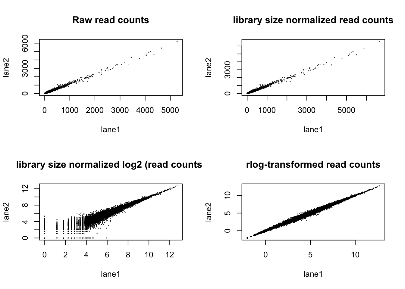
#mean-sd-plots based on all samples of the experiment
msd_plot <- meanSdPlot(log.norm.counts, ranks=FALSE, plot=FALSE)
msd_plot$gg + ggtitle("library size normalized log2 (read counts)") + ylab (" standard deviation") + ylim(0,1)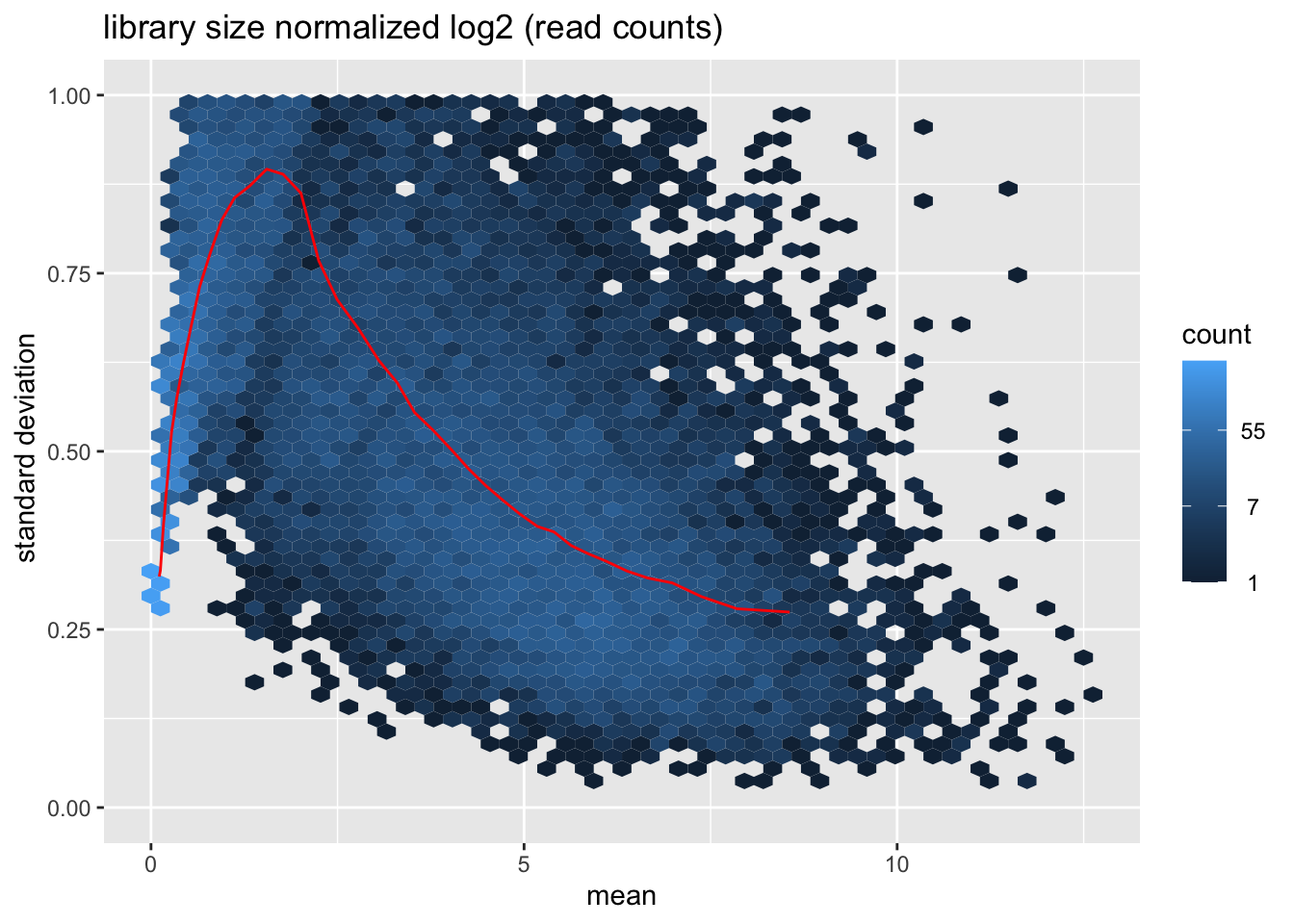
msd_plot <- meanSdPlot(rlog.norm.counts, ranks=FALSE, plot=FALSE)
msd_plot$gg + ggtitle("rlog-transformed read counts") + ylab ("standard deviation") + ylim(0,1)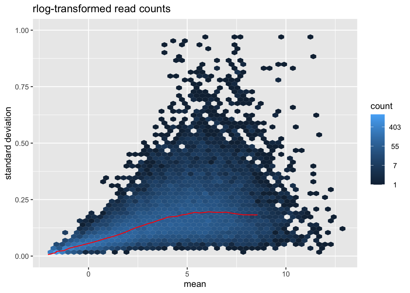
- Visually explore the normalized and transformed read counts between sample 1 and 2? Describe the differences between (1) raw read counts, (2) DESeq’s library size normalized counts, (3) log2 transformed DESeq’s library size normalized counts, and (4) DESeq’s rlog-transformed counts.
- Many statistical tests and analyses assume that data is homoskedastic, i.e. that all variables have similar variance. However, data with large differences among the sizes of the individual observations often shows heteroskedastic behavior. Do you see a dependence of the standard deviation (or variance) on the mean for (1) log2 transformed DESeq’s library size normalized counts, and (2) DESeq’s rlog-transformed counts?
Simulate counts that follow a Poisson distribution
set.seed(31)
sim <- t(sapply(dht_mean, rpois, n=4))
sim_mean <- apply(sim, 1, mean)
sim_var <- apply(sim, 1, var)
cor(sim_mean, sim_var, method="spearman")
## [1] 0.9446539sim.df <- as.data.frame(cbind(sim_mean, sim_var))
ggplot(sim.df, aes(sim_mean, sim_var)) + geom_point() + geom_smooth() + theme_bw(base_size = 18)## `geom_smooth()` using method = 'gam' and formula 'y ~ s(x, bs = "cs")'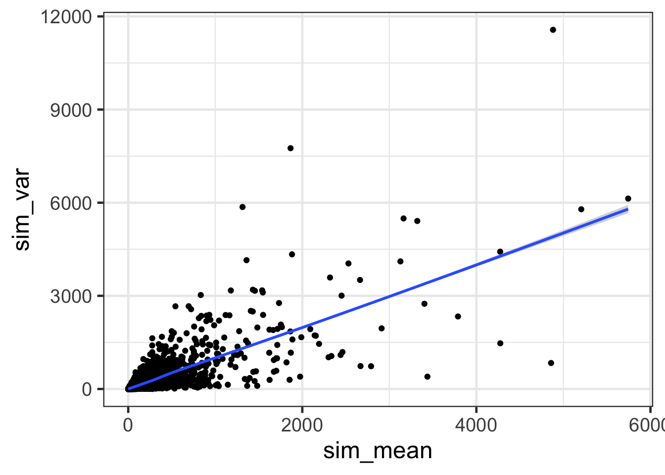
ggplot(sim.df, aes(sim_mean, sim_var)) + geom_point() + geom_smooth() + scale_x_continuous(trans='log2') + scale_y_continuous(trans='log2') + theme_bw(base_size = 18)## `geom_smooth()` using method = 'gam' and formula 'y ~ s(x, bs = "cs")'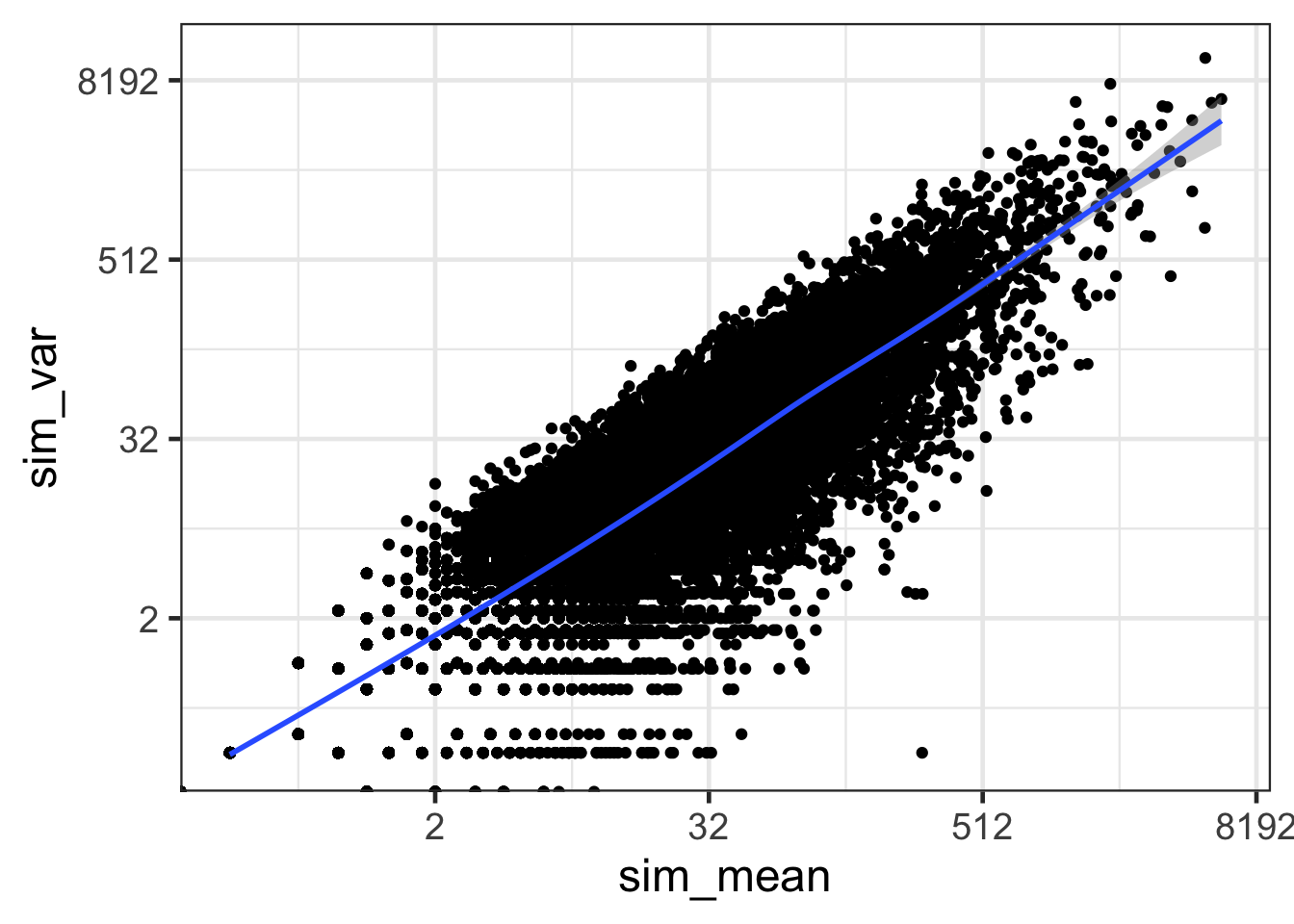
- How does the mean versus variance plot look for counts that follow a Poisson distribution?
EdgeR analysis for simulated counts that follow the Poisson distribution
sim.e <- DGEList(counts = sim, group=group)
sim.e <- calcNormFactors(sim.e)
sim.e <- estimateCommonDisp(sim.e, verbose=T)
## Disp = 1e-04 , BCV = 0.01sim.e <- estimateTagwiseDisp(sim.e)
summary(sim.e$tagwise.dispersion)## Min. 1st Qu. Median Mean 3rd Qu. Max.
## 1.571e-06 1.571e-06 1.571e-06 1.946e-03 6.434e-03 6.434e-03cor(sim.e$AveLogCPM, log2(sim_mean), method="spearman")## [1] 0.9998214plot(sim.e$AveLogCPM, log2(sim_mean), pch='.')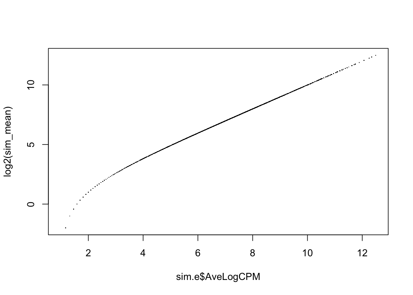
sim.df <- as.data.frame(cbind(sim.e$AveLogCPM, sim.e$tagwise.dispersion)); colnames(sim.df) <- c("AveLogCPM", "Dispersion")
ggplot(sim.df, aes(AveLogCPM, Dispersion)) + geom_point() + geom_smooth()
## `geom_smooth()` using method = 'gam' and formula 'y ~ s(x, bs = "cs")'
- How are tagwise (gene-wise) dispersion and the average log2 CPM (expression level) correlated in the count data from the Poisson distribution?
DESeq2 analysis for simulated counts that follow the Poisson distribution
do it yourself
Exploring global read count patterns with DESeq2
Hierarchical clustering
distance.m_rlog <- as.dist(1-cor(rlog.norm.counts, method="pearson"))
plot(hclust(distance.m_rlog), labels = colnames(rlog.norm.counts), main="rlog transformed read counts\ndistance: Pearson correlation")
- Can you make a dendrogram with Euclidean distance and linkage method “average”?
PCA
P <- plotPCA(DESeq.rlog)
P + theme_bw() + ggtitle("Rlog transformed counts")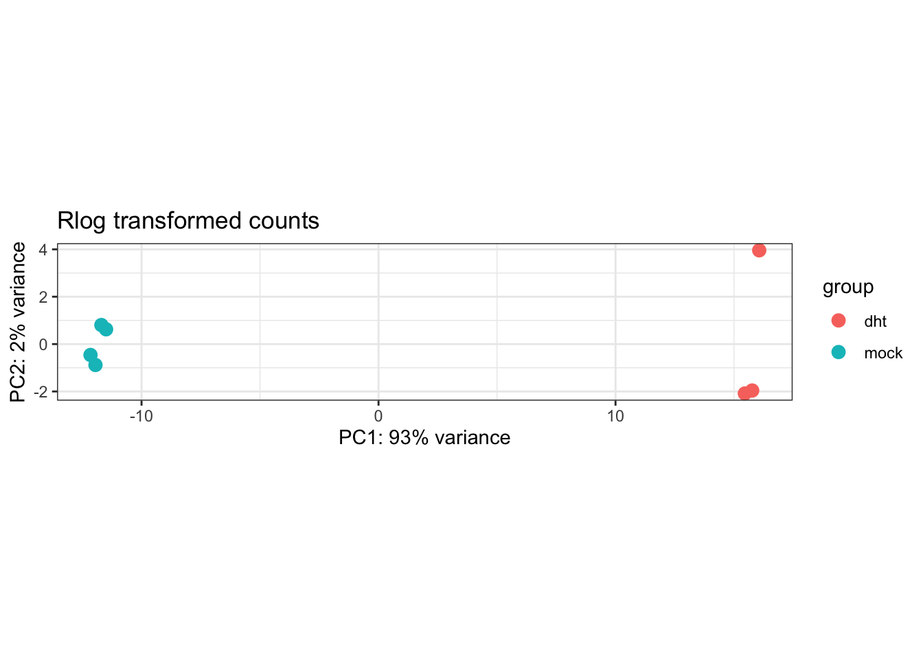
- How well can the different conditions be separated through dimensionality reduction? How much of the variance is described by the principle component that separates conditions?
Differential expression analysis with DESeq2
str(colData(DESeq.ds)$condition)## Factor w/ 2 levels "dht","mock": 2 2 2 2 1 1 1colData(DESeq.ds)$condition <- relevel(colData(DESeq.ds)$condition, "mock")
DESeq.ds <- DESeq(DESeq.ds)## using pre-existing size factors## estimating dispersions## gene-wise dispersion estimates## mean-dispersion relationship## final dispersion estimates## fitting model and testingDGE.results <- results(DESeq.ds, independentFiltering = TRUE, alpha = 0.05)
summary(DGE.results)##
## out of 21877 with nonzero total read count
## adjusted p-value < 0.05
## LFC > 0 (up) : 1663, 7.6%
## LFC < 0 (down) : 1468, 6.7%
## outliers [1] : 0, 0%
## low counts [2] : 8483, 39%
## (mean count < 3)
## [1] see 'cooksCutoff' argument of ?results
## [2] see 'independentFiltering' argument of ?results#Histogram of p-values for all genes tested for no differential expression between the two conditions
hist(DGE.results$pvalue, col = "grey" , border = "white", xlab = "", ylab = "", main = "frequencies of p-values")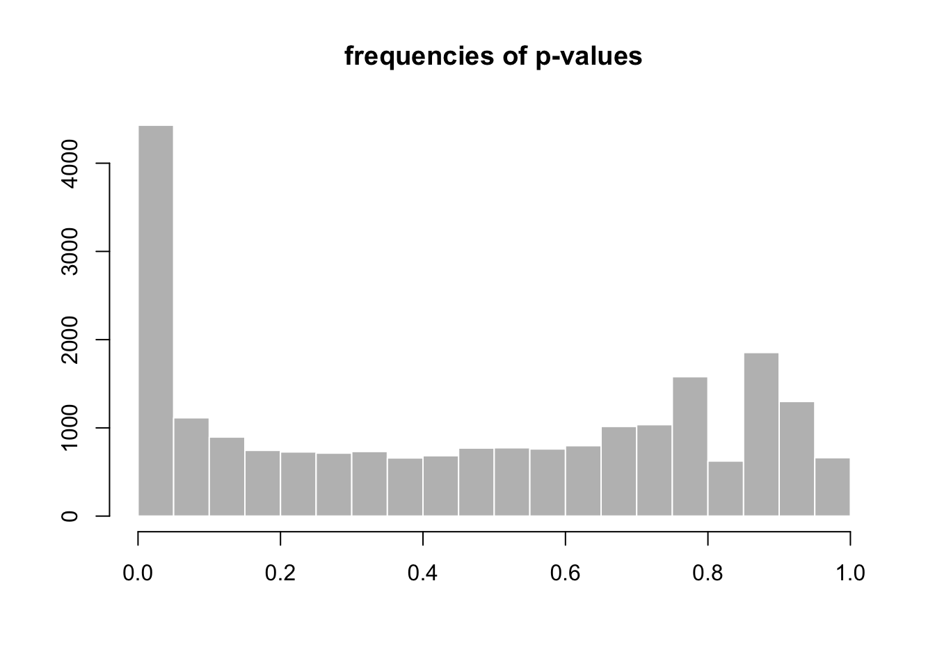
#MA plot
plotMA(DGE.results, alpha = 0.05, main = "Control vs. DHT-Treated" , ylim = c(-9,9))

#Heatmap
DGE.results.sorted <- DGE.results[order(DGE.results$padj), ]
DGEgenes <- rownames(subset(DGE.results.sorted, padj < 0.05))
hm.mat_DGEgenes <- log.norm.counts[DGEgenes,]
aheatmap(hm.mat_DGEgenes, Rowv = NA, Colv = NA)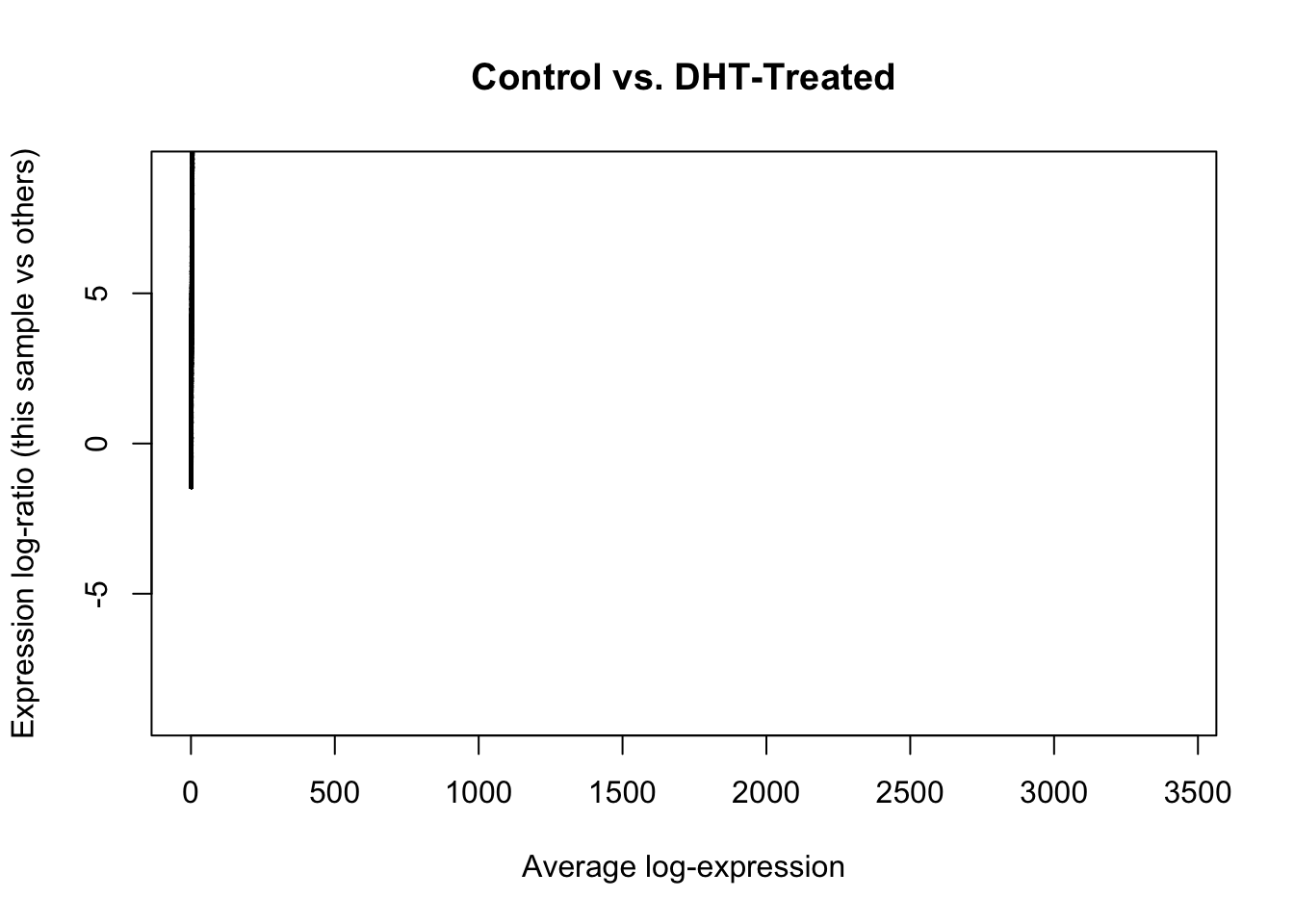
aheatmap(hm.mat_DGEgenes, Rowv = TRUE, Colv = TRUE, distfun = "euclidean", hclustfun = "average")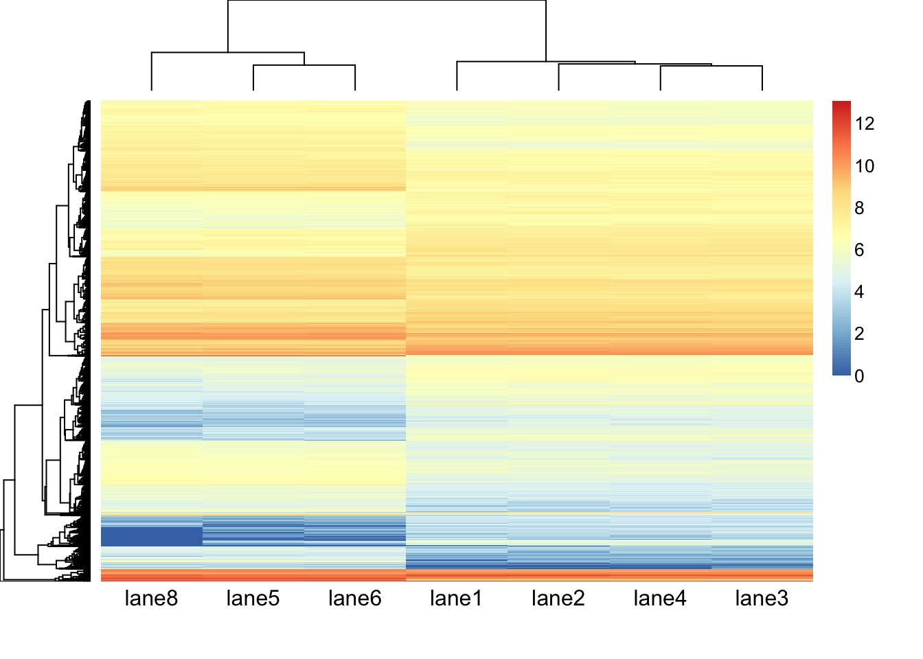
aheatmap(hm.mat_DGEgenes, Rowv = TRUE, Colv = TRUE, distfun = "euclidean", hclustfun = "average", scale = "row")
#Read counts of a single gene
#keytypes(org.Hs.eg.db)
#columns(org.Hs.eg.db)
anno <- select(org.Hs.eg.db, keys = DGEgenes, keytype = "ENSEMBL", columns = c("GENENAME", "SYMBOL"))
## 'select()' returned 1:many mapping between keys and columnsDGE.results.sorted_logFC <- DGE.results[order(DGE.results$log2FoldChange),]
DGEgenes_logFC <- rownames(subset(DGE.results.sorted_logFC, padj < 0.05))
head(anno[match(DGEgenes_logFC, anno$ENSEMBL),])## ENSEMBL GENENAME SYMBOL
## 391 ENSG00000091972 CD200 molecule CD200
## 824 ENSG00000100373 uroplakin 3A UPK3A
## 973 ENSG00000118513 MYB proto-oncogene, transcription factor MYB
## 1060 ENSG00000081237 protein tyrosine phosphatase receptor type C PTPRC
## 1055 ENSG00000196660 solute carrier family 30 member 10 SLC30A10
## 1130 ENSG00000117245 kinesin family member 17 KIF17subset(anno, SYMBOL == "TMEFF2") #known differential expressed gene in LNCaP human prostate cancer progression model## ENSEMBL
## 545 ENSG00000144339
## GENENAME
## 545 transmembrane protein with EGF like and two follistatin like domains 2
## SYMBOL
## 545 TMEFF2plotCounts(dds = DESeq.ds , gene = "ENSG00000144339", normalized = TRUE, transform = FALSE, main = expression(atop("Expression of "*italic("TMEFF2"))))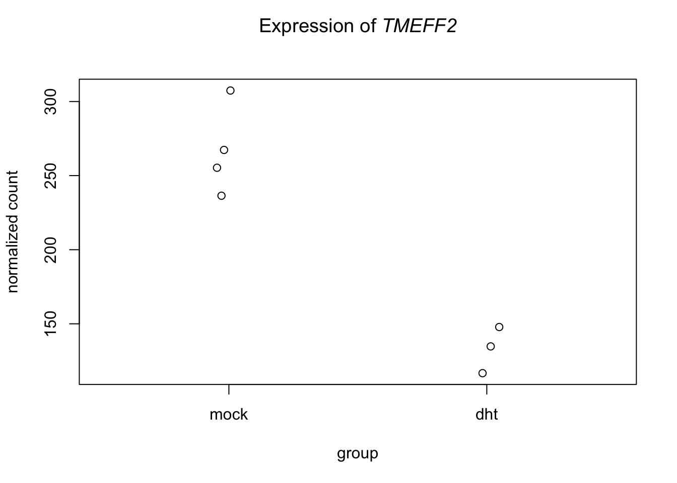
#merge DFE analysis with gene annotation
out.df <- merge(as.data.frame(DGE.results), anno, by.x = "row.names", by.y = "ENSEMBL")
#filter gene of interest
out.df %>% filter(SYMBOL=="TMEFF2")
## Row.names baseMean log2FoldChange lfcSE stat pvalue
## 1 ENSG00000144339 209.3953 -1.021127 0.1544868 -6.609805 3.84826e-11
## padj
## 1 9.562819e-10
## GENENAME SYMBOL
## 1 transmembrane protein with EGF like and two follistatin like domains 2 TMEFF2write.table(out.df, file = "de_exercise_DESeq2results.txt", sep = "\t", quote = FALSE, row.names = FALSE)- How many differentially expressed genes are found with multiple testing adjusted p<0.05?
- WHat is the function of TMEFF2? Does the expression profile of the gene fit with your expectations?
Differential expression analysis with edgeR of PNAS
do it yourself
Answers
- 21,877 genes have some expression from at least one lane
- The mean and variance of gene expression is correlated; the higher the expression, the higher the variance.
- The gene with the highest variance in the DHT treatment samples is ten fold higher than the gene with the highest variance in the mock samples.
- The biological variability (BCV) of (1) mock samples is 13.9% and (2) DHT treatment samples is 14.8%.
- EdgeR’s average log2 cpm calculations and our own are the same despite of the low counts.
- In the real RNA-seq data we observe that the higher the expression, the lower the tagwise dispersion.
- The different normalization and transformation steps make the read counts between samples more comparable.
- The dependence of the variance on the mean in the log transformed counts violate the assumption of homoskedasticity. The transformation of read counts including variance shrinkage with DESeq2’s rlog() function has removed this dependency (the standard deviation is roughly constant along the whole dynamic range).
- The mean versus the variance scatter plot of data simulated from a Poisson distribution is more symmetrical than real data.
- There is no dependency of dispersion and mean in the count data folloing the theoretical Poisson distribution.
- Run as.dist and hclust with the appropriate paramter settings. To find them check the help pages, e.g. by typing “?as.dist”.
- The first principle component seperates the two conditions and explains 95% of the varaince in the data (which is pretty high!)
- 1663 differentially expressed genes with LFC > 0 (up): 1663, 7.6%; and 1468 differentially expressed genes with LFC < 0 (down).
- …
Claus Ekstrøm 2021